
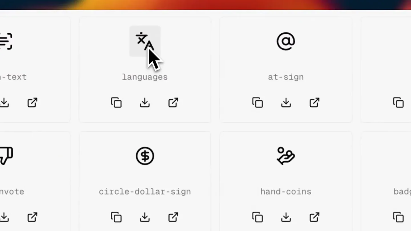
Bart ⚡ · Launch Video Breakdown: Hook, Pacing & Motion Design
My SVG icons won't be boring anymore 🤯 → Microanimations → Ready-to-copy components → CSS and Tailwind supported So simple, so impressive 🔥 #buildinpublic
Scene-by-scene timeline & spoken transcript
The Hook
Icon Grid Interaction Showcase
“(No spoken dialogue — Ambient visual with mouse clicks and icon animations.)”
- On screen
- scan-text, languages, at-sign, bell, users, upvote, downvote, circle-dollar-sign, hand-coins, badge-percent, chart-pie, gauge, pen-tool, fingerprint, link, layers, grip, git-pull-request, connect, volume, sun, party-popper, frame, bone
- Camera
- Static, slightly zoomed-out, top-down perspective on a grid of icons.
- Motion
- Mouse cursor interaction with individual icons, triggering micro-animations and state changes (e.g., checkmark on click).
Product Reveal
Dynamic Icon Selection & Animation
“(No spoken dialogue — Ambient visual with mouse clicks and icon animations.)”
- On screen
- scan-text, languages, at-sign, bell, users, upvote, downvote, circle-dollar-sign, hand-coins, badge-percent, chart-pie, gauge, pen-tool, fingerprint, link, layers, grip, git-pull-request, connect, volume, sun, party-popper, frame, bone
- Camera
- Static, slightly zoomed-out, top-down perspective on a grid of icons.
- Motion
- Continued mouse interaction, highlighting the responsiveness and variety of icon animations upon selection/hover.
Feature Teaser
Seamless Icon Micro-Animations
“(No spoken dialogue — Ambient visual with mouse clicks and icon animations.)”
- On screen
- scan-text, languages, at-sign, bell, users, upvote, downvote, circle-dollar-sign, hand-coins, badge-percent, chart-pie, gauge, pen-tool, fingerprint, link, layers, grip, git-pull-request, connect, volume, sun, party-popper, frame, bone
- Camera
- Static, slightly zoomed-out, top-down perspective on a grid of icons.
- Motion
- Focus on the subtle yet engaging micro-animations of various icons, demonstrating the product's core value proposition.
Call to Action
Final Icon Interaction & Product Value
“(No spoken dialogue — Ambient visual with mouse clicks and icon animations.)”
- On screen
- scan-text, languages, at-sign, bell, users, upvote, downvote, circle-dollar-sign, hand-coins, badge-percent, chart-pie, gauge, pen-tool, fingerprint, link, layers, grip, git-pull-request, connect, volume, sun, party-popper, frame, bone
- Camera
- Static, slightly zoomed-out, top-down perspective on a grid of icons.
- Motion
- Concluding sequence of mouse interactions, reinforcing the ease of use and the dynamic nature of the icons.
Motion design primitives
Synthesizable in Remotion · key components of the interactive-grid-showcase template.
IconHoverScale
When the mouse cursor hovers over an icon, the icon slightly scales up and a subtle shadow appears, indicating interactivity. Upon click, a checkmark or other state change animation occurs.
+ Code construction recipe
Use Remotion's `spring` for smooth scale transitions on hover. Implement conditional rendering for the checkmark SVG based on click state, animating its opacity and scale with `interpolate` or `spring`.
GridScrollPan
The grid of icons subtly pans horizontally and vertically, revealing more icons as if scrolling through a larger library. This motion is continuous and smooth.
+ Code construction recipe
Employ `interpolate` on the `translateX` and `translateY` properties of the icon grid container, mapping the animation progress to a continuous scroll-like motion. Ensure seamless looping if desired.
MicroAnimationTrigger
Specific icons exhibit unique, short, and delightful animations upon interaction, such as a 'party-popper' icon bursting or a 'sun' icon radiating light.
+ Code construction recipe
Each icon component can have its own internal `Sequence` or `spring` animation triggered by a prop (e.g., `isInteracted`). Use SVG path animations or CSS transforms for the specific micro-effects.
Style DNA & aesthetic system
Visual aesthetic
Typography
Motion
Special effects
Pacing & rhythm
Conceptual story rhythm
- 1
Interactive Discovery
Purpose. Immediately showcase the product's core interactive functionality and visual appeal.
Execution. Mouse cursor rapidly navigates and interacts with various icons, triggering their unique micro-animations.
- 2
Feature Highlight Reel
Purpose. Demonstrate the breadth and quality of the icon library and its dynamic capabilities.
Execution. A continuous flow of different icons being selected and animated, highlighting variety and responsiveness.
- 3
Ease of Use
Purpose. Convey that using these micro-animations is simple and intuitive.
Execution. The fluid, unhesitating mouse movements and instant feedback from the icons reinforce user-friendliness.
- 4
Visual Delight
Purpose. Leave the viewer with a lasting impression of the product's engaging and polished nature.
Execution. The final interactions are quick and satisfying, ending on a positive, dynamic note.
Remix in Animatiq Studio
Master remix prompt · agent-ready
Sample remix
Objective
Showcasing a new component library for React developers.How the recipe adapts
Instead of SVG icons, the grid items would be interactive React components (e.g., buttons, input fields, cards). Hovering over a component would trigger a subtle scale and shadow, while clicking would reveal a small code snippet or a live state change animation within the component itself. The monospace font would be used for component names, and the warm gradient background would remain, providing a familiar yet fresh aesthetic.Remix blueprint · interactive-grid-showcase
Scene durations (4 scenes, 16s)
Key Remotion components
Related Tech & SaaS Product Launches
Explore all Tech & SaaS launches →
Unreal Engine 6 has been announced with Rocket League.
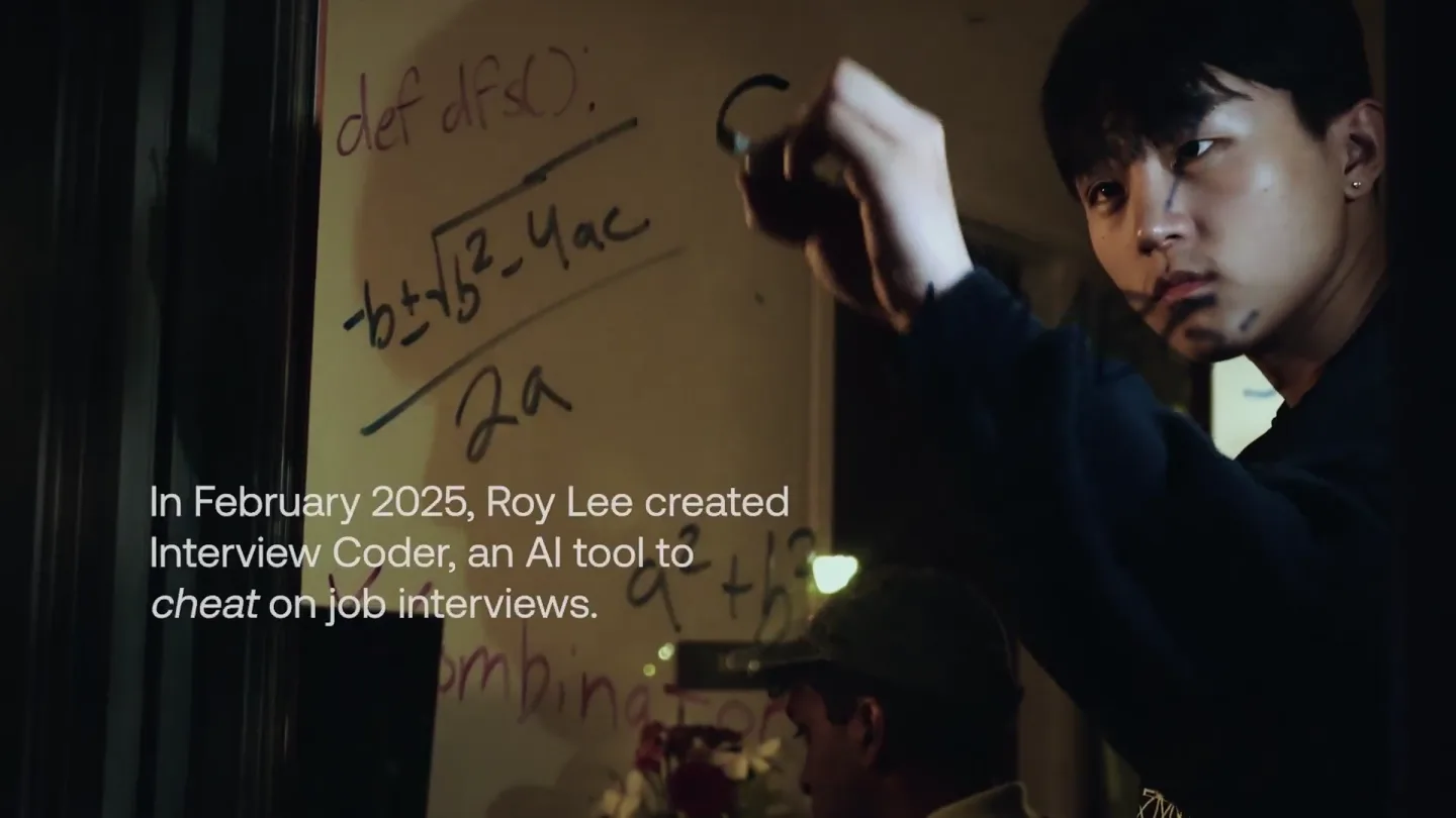
announcing @cluely's $15M fundraise, led by @a16z. cheat on everything.
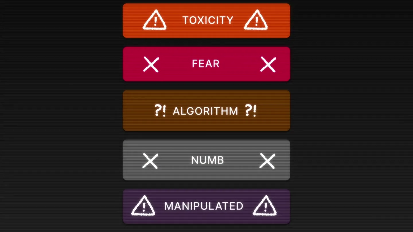
Yesterday we launched Bouncer to put users in control of their Twitter feed. Today, we open sourced the Chrome extension. We believe software should align with your interests, not the company that…