
Anthony Castrio · Launch Video Breakdown: Hook, Pacing & Motion Design
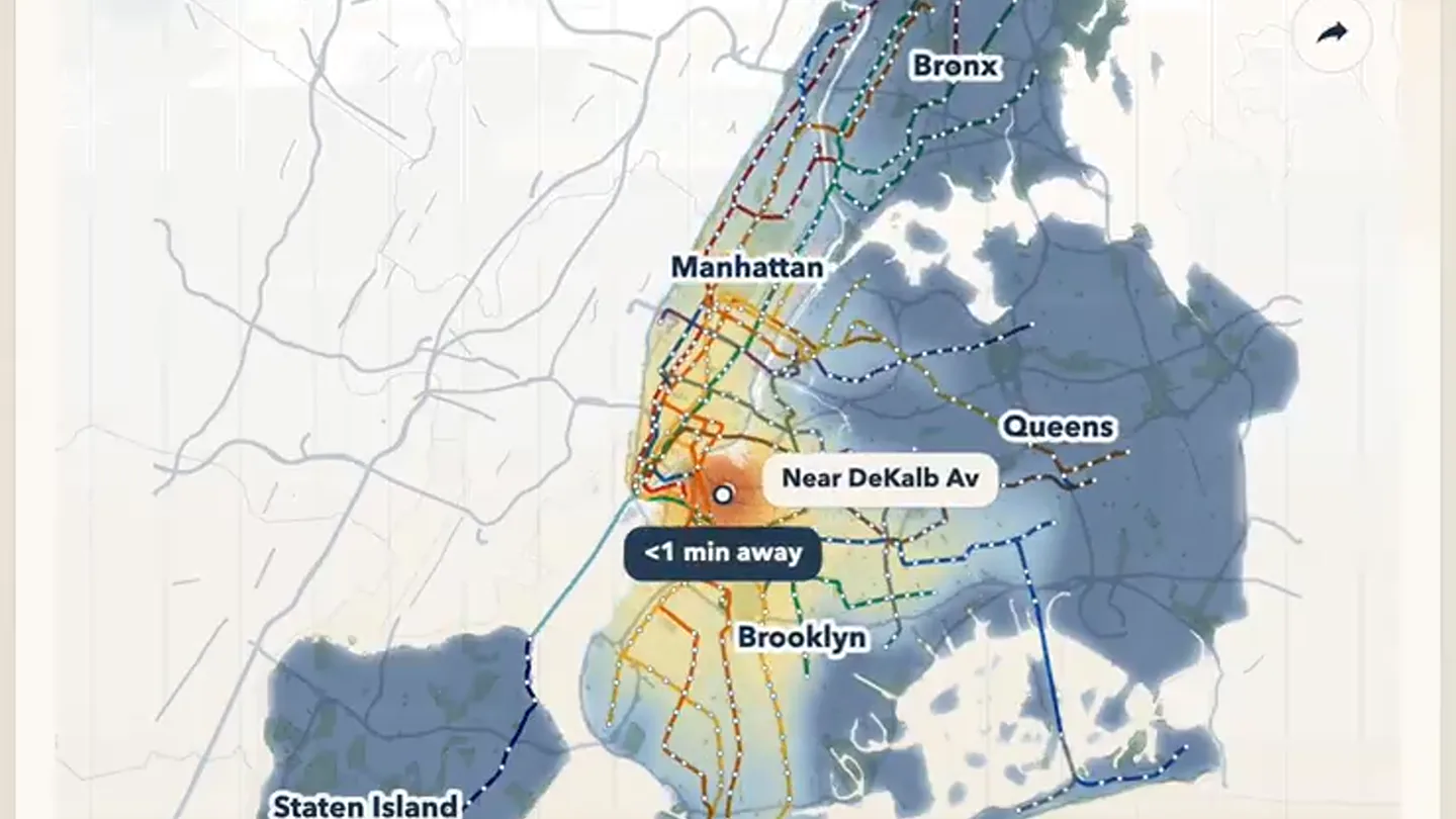
I made a super simple website where you can see everywhere you can get to in under an hour on the NYC subway. The generated map is both a heat-map (changes color) and a cartogram (warps space). htt…
Scene-by-scene timeline & spoken transcript
The Hook
Dynamic Commute-Time Warp Map Introduction
“(No spoken dialogue — ambient visual with rapid location changes)”
- On screen
- Commute-time warp Pinned near East Broadway warp heatmap Bronx Manhattan Queens Near East Broadway <1 min away Brooklyn Staten Island 0m 100m
- Camera
- Static overhead map view, focused on the NYC area.
- Motion
- Rapid sequential updates of the map's 'pinned' location and corresponding heatmap/cartogram distortion.
Product Reveal
Interactive Heatmap & Cartogram Demonstration
“(No spoken dialogue — ambient visual with rapid location changes)”
- On screen
- Commute-time warp Pinned near DeKalb Av warp heatmap Bronx Manhattan Queens Near DeKalb Av <1 min away Brooklyn Staten Island 0m 100m
- Camera
- Fixed perspective, showcasing the map's dynamic data visualization.
- Motion
- Seamless, instant transitions between different pinned locations, highlighting the real-time data processing and visual feedback.
Feature Teaser
Exploring NYC Subway Reachability
“(No spoken dialogue — ambient visual with rapid location changes)”
- On screen
- Commute-time warp Pinned near Woodhaven Blvd warp heatmap Bronx Manhattan Queens Near Woodhaven Blvd <1 min away Brooklyn Staten Island 0m 100m
- Camera
- Consistent overhead view, emphasizing the geographical spread of the data.
- Motion
- The map's 'warp' and 'heatmap' features are implicitly demonstrated through the changing visual representation of commute times.
Call to Action
Final Location Showcase & Product Utility
“(No spoken dialogue — ambient visual with rapid location changes)”
- On screen
- Commute-time warp Pinned near 82 St-Jackson Hts warp heatmap Bronx Manhattan Queens Near 82 St-Jackson Hts <1 min away Brooklyn Staten Island 0m 100m
- Camera
- Static, concluding shot of the map, reinforcing the product's core function.
- Motion
- The final rapid location change serves as a summary of the product's dynamic capabilities, leaving the viewer with a clear understanding of its utility.
Motion design primitives
Synthesizable in Remotion · key components of the dynamic-geo-analytics-showcase template.
GeoHeatCartogramWarp
A geographical map dynamically warps its space and displays a color-coded heatmap based on a changing 'pinned' central location, indicating commute times.
+ Code construction recipe
Utilize SVG path manipulation for cartogram warping, driven by an `interpolate` function based on data points. Implement a `linear-gradient` or `radial-gradient` for the heatmap, dynamically adjusting color stops and opacity based on calculated commute time data. Use `spring` for subtle, organic transitions of the heatmap intensity and warp effect.
LocationPinPulse
A circular marker indicating the 'pinned' location subtly pulses and changes position across the map, accompanied by a small text label.
+ Code construction recipe
Animate the `transform` (translate) property of the pin SVG element using `interpolate` for smooth movement between coordinates. Apply a `spring` animation to the `scale` and `opacity` of the pin and its associated text label for a subtle pulse effect upon new location selection.
SubwayLineHighlight
Subway lines on the map are highlighted with varying colors and dashed patterns, indicating their accessibility and connection to the heatmap.
+ Code construction recipe
Render subway lines as SVG paths. Dynamically adjust `stroke` color and `stroke-dasharray` properties based on proximity to the 'pinned' location and heatmap data. Use `interpolate` for smooth color transitions and `spring` for subtle dash pattern changes.
Style DNA & aesthetic system
Visual aesthetic
Typography
Motion
Special effects
Pacing & rhythm
Conceptual story rhythm
- 1
Initial Data State
Purpose. Introduce the core interface and its primary function: visualizing commute times.
Execution. The map appears with an initial pinned location and its corresponding heatmap/cartogram.
- 2
Rapid Location Cycling
Purpose. Demonstrate the product's interactivity and the breadth of its data visualization capabilities.
Execution. The pinned location rapidly changes, showcasing how the map instantly updates its warp and heatmap for each new point.
- 3
Feature Highlight (Implicit)
Purpose. Showcase the 'warp' and 'heatmap' features in action without explicit narration.
Execution. The continuous, dynamic changes in map geometry and color gradients visually explain the core features.
- 4
Summary & Utility
Purpose. Reinforce the product's value proposition by demonstrating its practical application across various NYC locations.
Execution. The video concludes with a final rapid location change, summarizing the product's ability to quickly analyze commute times from any point.
Remix in Animatiq Studio
Master remix prompt · agent-ready
Sample remix
Objective
A real estate platform that visualizes property value changes over time in San Francisco.How the recipe adapts
The GeoHeatCartogramWarp primitive would adapt to show San Francisco neighborhoods, with the heatmap colors representing property values and the cartogram warping based on value density. The LocationPinPulse would highlight specific property listings or neighborhood centers. SubwayLineHighlight would be replaced by 'ZoningOverlayHighlight', using different colors and patterns to denote various zoning classifications or school districts. The rapid cuts would showcase different time periods or filter applications, demonstrating the platform's analytical speed.Remix blueprint · dynamic-geo-analytics-showcase
Scene durations (4 scenes, 9.9s)
Key Remotion components
Related Tech & SaaS Product Launches
Explore all Tech & SaaS launches →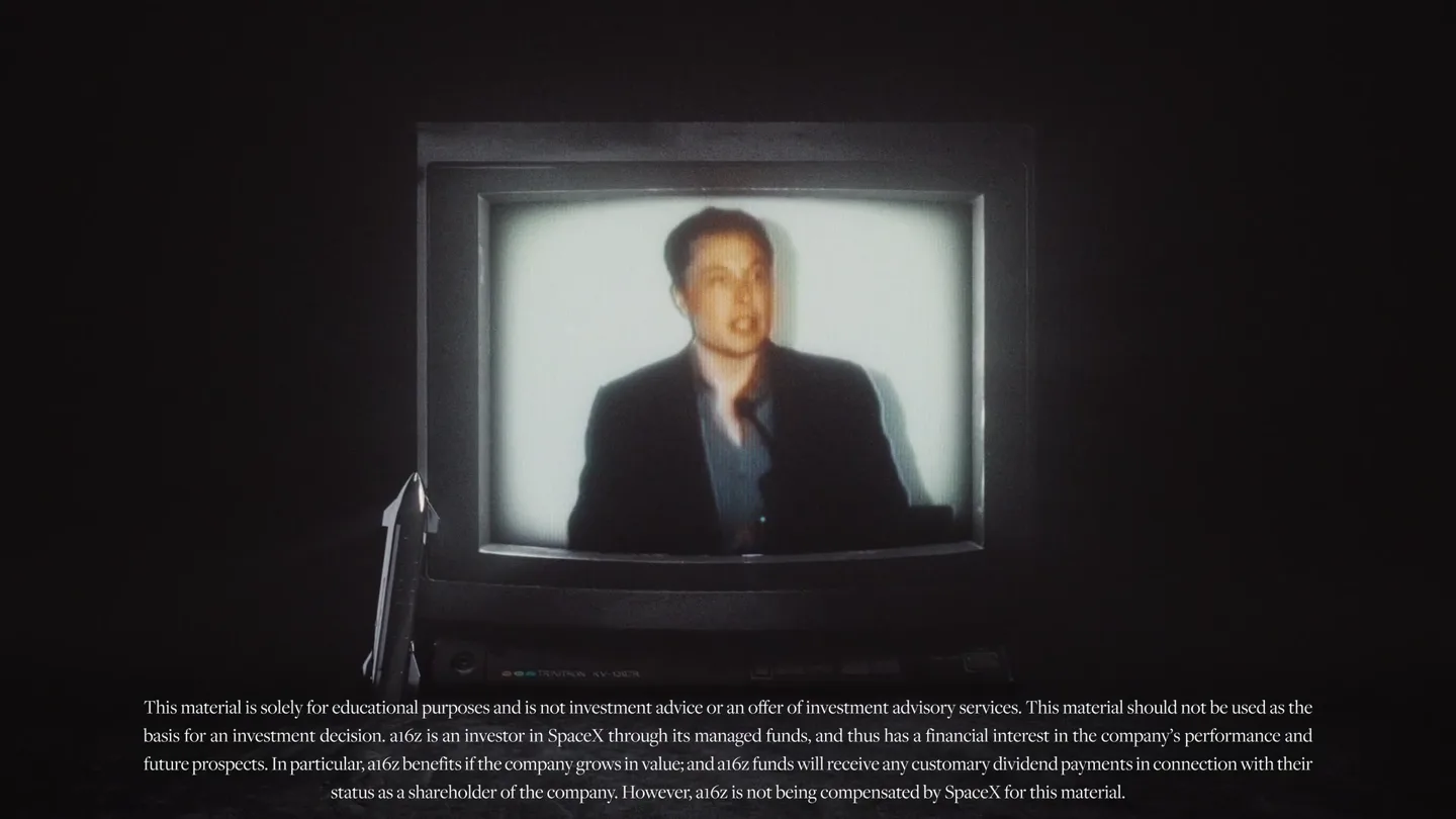
Against all odds. Congrats @elonmusk and @SpaceX.
Unreal Engine 6 has been announced with Rocket League.

Trade 24/7 with a social feed and onchain signals.