
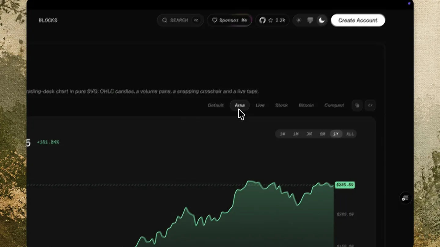
Spectrum UI · Launch Video Breakdown: Hook, Pacing & Motion Design
SVG Charts is a collection of minimal, animated chart components for React. Add interactive charts with a single CLI command. Open source, part of Spectrum UI.
Scene-by-scene timeline & spoken transcript
The Hook
Interactive Chart Showcase
“(No spoken dialogue — ambient visual with mouse clicks and hovers)”
- On screen
- SPECTRUM UI COMPONENTS BLOGS COLORS BLOCKS SEARCH SPONSOR ME 1.2K CREATE ACCOUNT AI Assistants Pricing Tables Charts Market Chart Candlestick Chart Price Chart Indicator Chart Order Book Portfolio Chart Area Chart Bar Chart Line Chart Composed Chart Pie Chart Radar Chart Radial Chart Histogram Connecting Real Data Stat Cards Cohort Retention Calendar Heatmap Market Chart A trading-desk chart in pure SVG, OHLC candles, a volume pane, a snapping crosshair and a live tape. Default Live Stock Bitcoin Compact Candlestick Chart OHLC candles with optional volume and hollow-up bodies, for stocks and any market pair. Default Stock Volume Hollow Price Chart A line chart with last price and signed delta – for tokens, equities or protocol TVL. Default Stock TVL Compare Indicator Chart A line chart with multiple indicators, including moving averages and Bollinger bands. Default Stock Compare Order Book A trading ladder with cumulative depth bars, a spread row and flashing updates in live mode. Default Ethereum Portfolio Chart Account value against cost basis, with drawdown from the running peak shaded underneath. Default Flat Area Chart Filled areas with gradient, hatch, dotted, stacked and dashed-stroke variants. Default Hatched Dotted Solid Stacked Bump Dashed Bar Chart Vertical and horizontal bars with hatch, duotone, gradient, stripe, stack, percent and glow fills. Default Hatched Duotone Reverse Gradient Striped Stacked Percent Horizontal Glowing Line Chart A line chart with multiple series, optional markers, and a smooth curve. Default Markers Smooth Glowing Composed Chart Bars, lines and areas on one plot — mix fills, dashes and glow per series. Default Hatched Duotone Dashed Glowing Pie Chart Pie and donut charts with padded sectors, labels and optional sector glow. Default Donut Padded Labels Glowing Radar Chart Radar plots with filled or outline series, circle grids and glow. Default Lines Circle Glowing Radial Chart Full and semi-circle radial bars for share and progress. Default Semi Glowing Histogram Raw samples binned on nice edges, with the long tail folded into one labelled overflow bin. Default Orders
- Camera
- Static wide shot of the UI, with mouse cursor interacting with various chart types.
- Motion
- Rapid-fire UI interactions, smooth transitions between chart states, and subtle hover effects.
Product Reveal
Diverse Chart Components in Action
“(No spoken dialogue — ambient visual with mouse clicks and hovers)”
- On screen
- SPECTRUM UI COMPONENTS BLOGS COLORS BLOCKS SEARCH SPONSOR ME 1.2K CREATE ACCOUNT AI Assistants Pricing Tables Charts Market Chart Candlestick Chart Price Chart Indicator Chart Order Book Portfolio Chart Area Chart Bar Chart Line Chart Composed Chart Pie Chart Radar Chart Radial Chart Histogram Connecting Real Data Stat Cards Cohort Retention Calendar Heatmap Stat Cards KPI cards with a big value, the delta written as a sentence, and a scrubbable sparkline beside it. Default Budget Cohort Retention The retention triangle: cohorts down, periods across, intensity by share retained. Default Weekly Calendar Heatmap A year of daily values as week columns — the contributions grid, with streak and total contributions. Default
- Camera
- Static wide shot of the UI, with mouse cursor interacting with various chart types.
- Motion
- Smooth scrolling and interactive demonstrations of different chart types, highlighting their responsiveness and visual variety.
Feature Teaser
Customization and Interactivity
“(No spoken dialogue — ambient visual with mouse clicks and hovers)”
- On screen
- SPECTRUM UI COMPONENTS BLOGS COLORS BLOCKS SEARCH SPONSOR ME 1.2K CREATE ACCOUNT AI Assistants Pricing Tables Charts Market Chart Candlestick Chart Price Chart Indicator Chart Order Book Portfolio Chart Area Chart Bar Chart Line Chart Composed Chart Pie Chart Radar Chart Radial Chart Histogram Connecting Real Data Stat Cards Cohort Retention Calendar Heatmap
- Camera
- Static wide shot of the UI, with mouse cursor interacting with various chart types.
- Motion
- Focus on interactive elements like tooltips, data point highlighting, and dynamic chart updates, showcasing the depth of customization.
Call to Action
Seamless Integration and Open Source
“(No spoken dialogue — ambient visual with mouse clicks and hovers)”
- On screen
- SPECTRUM UI COMPONENTS BLOGS COLORS BLOCKS SEARCH SPONSOR ME 1.2K CREATE ACCOUNT AI Assistants Pricing Tables Charts Market Chart Candlestick Chart Price Chart Indicator Chart Order Book Portfolio Chart Area Chart Bar Chart Line Chart Composed Chart Pie Chart Radar Chart Radial Chart Histogram Connecting Real Data Stat Cards Cohort Retention Calendar Heatmap
- Camera
- Static wide shot of the UI, with mouse cursor interacting with various chart types.
- Motion
- Final rapid-fire showcase of diverse charts, emphasizing the breadth of the library and the ease of integration.
Motion design primitives
Synthesizable in Remotion · key components of the spectrum-ui-interactive-dashboard template.
InteractiveChartHover
When the mouse cursor hovers over a data point or segment, a tooltip appears with detailed information, and the hovered element often highlights or expands slightly.
+ Code construction recipe
Utilize Remotion's `useCurrentFrame` and `interpolate` for smooth tooltip appearance (opacity, scale, position). Implement `spring` for the hover-triggered highlight/expansion effect on SVG elements, ensuring a natural, bouncy feel. Event listeners for mouse enter/leave on chart elements will trigger these animations.
DynamicChartUpdate
Charts dynamically re-render and animate data changes, such as switching between 'Live' and 'Stock' views, or adjusting timeframes, with smooth transitions of lines, bars, and areas.
+ Code construction recipe
Leverage Remotion's `Sequence` and `AbsoluteFill` for scene management. For data transitions, use `interpolate` on SVG path `d` attributes for line/area charts, and `height`/`y` attributes for bar charts. `spring` can be applied to individual data points or bars for a more organic update feel. Consider `measureText` for dynamic label positioning.
Style DNA & aesthetic system
Visual aesthetic
Typography
Motion
Special effects
Pacing & rhythm
Conceptual story rhythm
- 1
Initial Exploration
Purpose. Introduce the breadth of chart types available and demonstrate basic interactivity.
Execution. Mouse cursor rapidly navigates through the sidebar, clicking on different chart categories, with each chart instantly loading and showcasing its default state.
- 2
Deep Dive into Features
Purpose. Highlight specific interactive features and customization options within individual charts.
Execution. Cursor interacts with chart controls (e.g., 'Live' button, 'Volume' toggle, date range selectors), showing dynamic data updates and visual changes.
- 3
Showcasing Variety
Purpose. Emphasize the diverse visual styles and data representations possible.
Execution. Quick succession of different chart types (e.g., Area, Bar, Pie, Radar) being displayed, often with a quick hover to reveal tooltips.
- 4
Concluding Overview
Purpose. Reinforce the comprehensive nature of the library and its ease of use.
Execution. A final, swift scroll through multiple chart examples, ending with a clear view of the UI's overall structure.
Remix in Animatiq Studio
Master remix prompt · agent-ready
Sample remix
Objective
A new real-time API monitoring dashboard for developers.How the recipe adapts
The recipe adapts by replacing chart components with API latency graphs, error rate heatmaps, and request volume timelines. The interactive hover primitive will show detailed API call logs, and the dynamic update primitive will animate real-time data streams. The sidebar navigation will switch between different API endpoints or service views, maintaining the dark theme and responsive UI interactions.Remix blueprint · spectrum-ui-interactive-dashboard
Scene durations (4 scenes, 72s)
Key Remotion components
Related Developer Tools Product Launches
Explore all Developer Tools launches →
Agentic CLI for coding, building apps, and automating workflows.
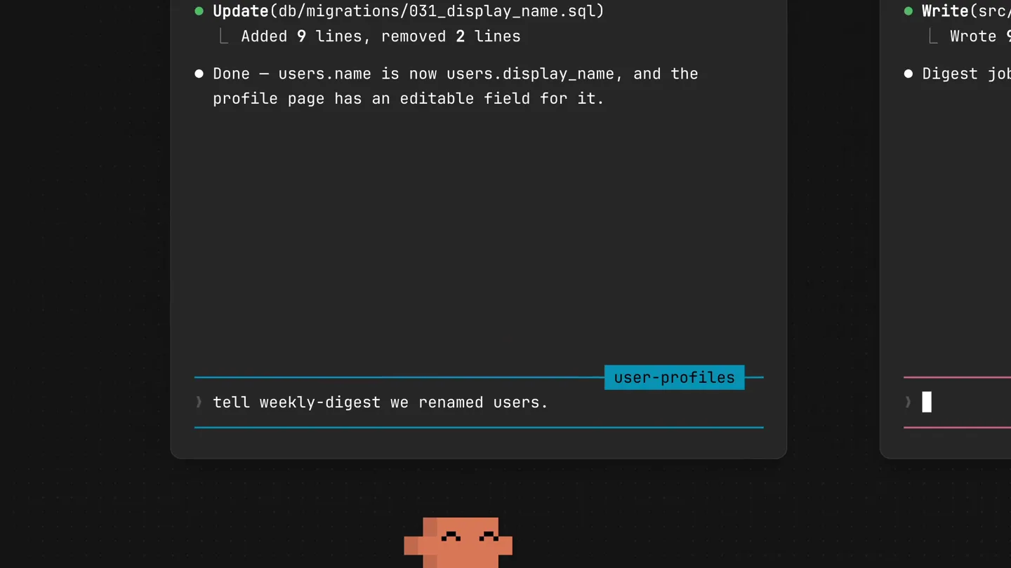
New in Claude Code: your sessions can now message each other. Tell Claude to send a summary (not your history or files), and the other session picks it up mid-task.

Meet Qwen3.8-Max: A New Bar for Coding and Cowork. https://t.co/mJaA8vr6xT