
Crit · Launch Video Breakdown: Hook, Pacing & Motion Design
A Figma Community agent that reviews UX heuristics, accessibility, hierarchy, interaction, brand, and polish before you ship.
Scene-by-scene timeline & spoken transcript
The Hook
Crit's AI-Powered Figma Review
“(No spoken dialogue — The track begins with a sustained, evolving pad sound, creating an atmospheric and slightly mysterious mood. At 00:05, a subtle, high-frequency riser begins, building tension. This culminates in a significant sub-bass drop/impact at 00:07, accompanied by a percussive synth hit and a brief, almost glitch-like sound effect.)”
- On screen
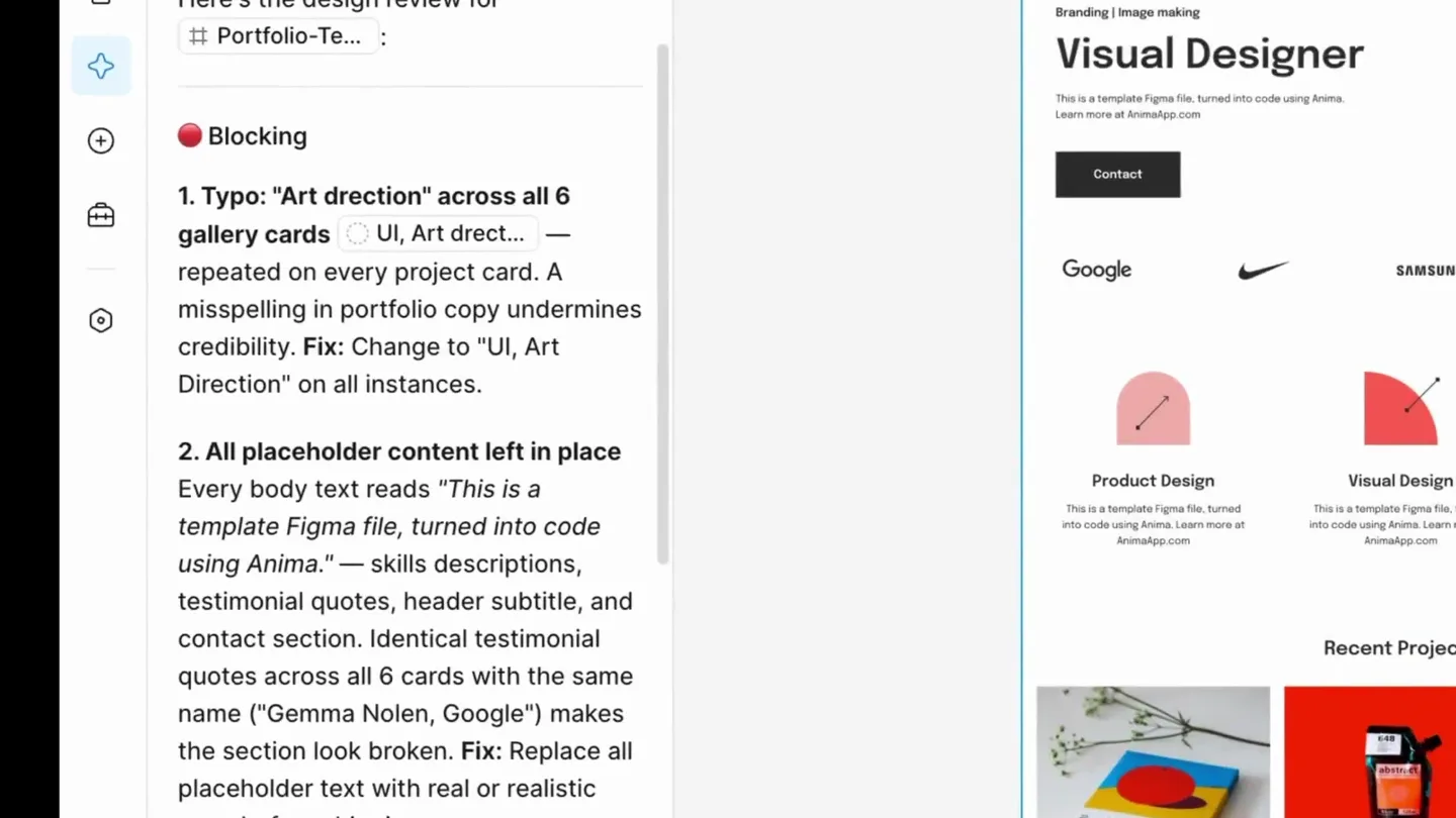
- Review design ch... Beta + ... Shared Blocking 1. Typo: "Art direction" across all 6 gallery cards — UI, Art direct... repeated on every project card. A misspelling in portfolio copy undermines credibility. Fix: Change to "UI, Art Direction" on all instances. 2. All placeholder content left in place Every body text reads "This is a template Figma file, turned into code using Anima." — skills descriptions, testimonial quotes, header subtitle, and contact section. Identical testimonial quotes across all 6 cards with the same name ("Gemma Nolen, Google") makes the section look broken. Fix: Replace all placeholder text with real or realistic copy before shipping. Important 3. Display headline (68px) has 0% letter-spacing Visual Desig... at 68px with no negative tracking looks loose and airy. Large display type benefits from tightened letter-spacing. Fix: Set letter-spacing to approximately -2% to -3% on the 68px headline. 4. Type scale has a gap — 27px to 68px is a 2.5x jump The scale is 17 -> 20 -> 27 -> 32 -> 68. The leap from section headings (32px) to the hero headline (68px) skips an intermediate step, making the hierarchy feel like it has only two modes: "heading" and "everything else." Fix: Consider an intermediate heading size around 48px for secondary hero or section emphasis, or tighten the hero to ~56px to bring the ratio closer to ~1.75x. 5. Hero CTA button has 0px corner radius — sharp rectangle Contact But... has hard 90° corners while sitting against organic hero imagery. It reads as unfinished rather than intentionally brutalist given the rest of the design's soft aesthetic. Fix: Add a corner radius (8px for subtle rounding, or 39px for full pill shape matching the button height). Be consistent with the Submit button in the contact section. 6. Contact section heading: "Lets" missing apostrophe Lets work to... — should be "Let's work together." Fix: Add the apostrophe. 7. No interactive states visible on nav items or buttons The nav links ( Menu items ) and CTA buttons show no hover, focus, or active variants. A portfolio template should demonstrate craft through attention to interactive states. Fix: Add hover (underline or color shift), focus-visible (outline ring), and active (slight scale/darken) states to nav links and buttons. 8. Testimonial section is entirely uniform — no differentiation All 6 testimonial cards use the same name, company, quote, and star rating. Even as a template, this makes it impossible to judge the visual rhythm when real content varies in length. Fix: Vary the placeholder names, companies, and quote lengths across cards to stress-test the layout. Polish 9. Logo bar icons are ungrouped vectors The Google logo is 6 separate vectors in a loose group. This is fragile — easy to accidentally shift one piece. Fix: Flatten each brand logo into a single vector or component for resilience. 10. Section heading inconsistency Recent Proj... and Client Testi... are center-aligned, but the hero headline is left-aligned. This isn't wrong, but the shift between sections could be more intentional — either commit to centered section titles with a subtle divider/spacer, or align everything left. 11. Gallery card labels all say "Project title" — no visual weight hierarchy Project title at 20px SemiBold and the subtitle at 17px Regular are close in visual weight. The title doesn't stand out enough from the subtitle below it. Fix: Bump the card title to 22-24px or use bold (700) to create clearer separation from the 17px subtitle. 12. Body text line-height (27px at 17px = 1.59) is slightly tall 17px with 27px line-height gives a 1.59 ratio. This works but leans airy — especially in the skills card descriptions where the text block is narrow (311px wide). Fix: Tighten to 26px (1.53) for a slightly more cohesive feel, or keep as-is if the open rhythm is intentional. Strengths Clean, well-structured auto-layout. The entire page uses vertical auto-layout with sections stacking cleanly at 0 gap — structurally sound and easy to maintain. Consistent single typeface (Epilogue). One family throughout with clear weight separation (Regular 400 vs SemiBold 600) keeps things cohesive. Restrained palette. Primarily #2D2D2D on white/ #F3F3F3 with a single coral accent ( #FF6250 ) — disciplined and scannable. Component usage. Skills cards, gallery cards, and testimonial cards are all instances, making updates easy and consistent. Highest-leverage change: Fix the placeholder copy first — the typos ("direction", "Lets"), the identical testimonials, and the Anima boilerplate. No amount of visual polish matters if the text undermines trust. After that, tighten the display headline's letter-spacing — it's the single biggest visual refinement for minimum effort. Would you like me to apply the safe fixes (typo corrections, letter-spacing, corner radius)? #Portfolio-Templ... x yes
- Camera
- The camera is static, presenting a full view of a Figma interface with a detailed critique panel on the left and a design canvas on the right. The focus is initially blurred on the right (design canvas) and sharp on the left (critique panel), then shifts to sharpen the design canvas.
- Motion
- Depth of field rack focus, subtle zoom out, and a smooth scroll animation on the critique panel revealing more text.
Problem Agitation
Identifying Design Flaws
“(No spoken dialogue — The music transitions into a more rhythmic section with a driving, arpeggiated synth melody and a prominent sub-bass line, maintaining a consistent tempo. At 00:15, another subtle riser begins, leading to a more pronounced sub-bass impact and a new melodic phrase at 00:17.)”
- On screen
- Review design ch... Beta + ... Shared Blocking 1. Typo: "Art direction" across all 6 gallery cards — UI, Art direct... repeated on every project card. A misspelling in portfolio copy undermines credibility. Fix: Change to "UI, Art Direction" on all instances. 2. All placeholder content left in place Every body text reads "This is a template Figma file, turned into code using Anima." — skills descriptions, testimonial quotes, header subtitle, and contact section. Identical testimonial quotes across all 6 cards with the same name ("Gemma Nolen, Google") makes the section look broken. Fix: Replace all placeholder text with real or realistic copy before shipping. Important 3. Display headline (68px) has 0% letter-spacing Visual Desig... at 68px with no negative tracking looks loose and airy. Large display type benefits from tightened letter-spacing. Fix: Set letter-spacing to approximately -2% to -3% on the 68px headline. 4. Type scale has a gap — 27px to 68px is a 2.5x jump The scale is 17 -> 20 -> 27 -> 32 -> 68. The leap from section headings (32px) to the hero headline (68px) skips an intermediate step, making the hierarchy feel like it like it has only two modes: "heading" and "everything else." Fix: Consider an intermediate heading size around 48px for secondary hero or section emphasis, or tighten the hero to ~56px to bring the ratio closer to ~1.75x. 5. Hero CTA button has 0px corner radius — sharp rectangle Contact But... has hard 90° corners while sitting against organic hero imagery. It reads as unfinished rather than intentionally brutalist given the rest of the design's soft aesthetic. Fix: Add a corner radius (8px for subtle rounding, or 39px for full pill shape matching the button height). Be consistent with the Submit button in the contact section. 6. Contact section heading: "Lets" missing apostrophe Lets work to... — should be "Let's work together." Fix: Add the apostrophe. 7. No interactive states visible on nav items or buttons The nav links ( Menu items ) and CTA buttons show no hover, focus, or active variants. A portfolio template should demonstrate craft through attention to interactive states. Fix: Add hover (underline or color shift), focus-visible (outline ring), and active (slight scale/darken) states to nav links and buttons. 8. Testimonial section is entirely uniform — no differentiation All 6 testimonial cards use the same name, company, quote, and star rating. Even as a template, this makes it impossible to judge the visual rhythm when real content varies in length. Fix: Vary the placeholder names, companies, and quote lengths across cards to stress-test the layout. Polish 9. Logo bar icons are ungrouped vectors The Google logo is 6 separate vectors in a loose group. This is fragile — easy to accidentally shift one piece. Fix: Flatten each brand logo into a single vector or component for resilience. 10. Section heading inconsistency Recent Proj... and Client Testi... are center-aligned, but the hero headline is left-aligned. This isn't wrong, but the shift between sections could be more intentional — either commit to centered section titles with a subtle divider/spacer, or align everything left. 11. Gallery card labels all say "Project title" — no visual weight hierarchy Project title at 20px SemiBold and the subtitle at 17px Regular are close in visual weight. The title doesn't stand out enough from the subtitle below it. Fix: Bump the card title to 22-24px or use bold (700) to create clearer separation from the 17px subtitle. 12. Body text line-height (27px at 17px = 1.59) is slightly tall 17px with 27px line-height gives a 1.59 ratio. This works but leans airy — especially in the skills card descriptions where the text block is narrow (311px wide). Fix: Tighten to 26px (1.53) for a slightly more cohesive feel, or keep as-is if the open rhythm is intentional. Strengths Clean, well-structured auto-layout. The entire page uses vertical auto-layout with sections stacking cleanly at 0 gap — structurally sound and easy to maintain. Consistent single typeface (Epilogue). One family throughout with clear weight separation (Regular 400 vs SemiBold 600) keeps things cohesive. Restrained palette. Primarily #2D2D2D on white/ #F3F3F3 with a single coral accent ( #FF6250 ) — disciplined and scannable. Component usage. Skills cards, gallery cards, and testimonial cards are all instances, making updates easy and consistent. Highest-leverage change: Fix the placeholder copy first — the typos ("direction", "Lets"), the identical testimonials, and the Anima boilerplate. No amount of visual polish matters if the text undermines trust. After that, tighten the display headline's letter-spacing — it's the single biggest visual refinement for minimum effort. Would you like me to apply the safe fixes (typo corrections, letter-spacing, corner radius)? #Portfolio-Templ... x yes
- Camera
- The camera remains static, focused on the Figma interface. The critique panel on the left is fully visible and sharp, while the design canvas on the right is also sharp.
- Motion
- A cursor hovers over the 'yes' button in the chat interface, then clicks it. A loading spinner appears, followed by a rapid-fire display of applied fixes.
Product Reveal
Automated Fixes Applied
“(No spoken dialogue — The track continues with layered synth elements, including a shimmering, high-frequency texture and a sustained pad.)”
- On screen
- Review design ch... Beta + ... Shared Worked for 25s. All four fixes are applied: 6 typos fixed — "Art direction" -> "Art Direction" across all gallery cards Apostrophe added — Let's work together Letter-spacing tightened — Visual Desig... headline now has -2.5% tracking (you can see it's a bit more compact in the verification) Corner radius added — Contact But... now has 8px rounding The remaining recommendations (varying testimonial content, adding interactive states, adjusting the type scale gap, replacing placeholder copy) are more subjective and content-dependent — happy to tackle any of those if you'd like. How does it look? Current version Undo #Portfolio-Templ... x Ask for changes Chat Design Prototype 32% Frame Position X 0 Y 0 W 1282 H 3473.83 Auto layout Clip content Appearance 100% 50% Fill FFFFFF Show in exports Stroke Effects Selection colors Layout guide Export PNG Export Portfolio-Template Preview
- Camera
- The camera remains static, showing the Figma interface. The critique panel updates with a summary of applied fixes, and the design canvas on the right visually updates to reflect these changes.
- Motion
- The design canvas on the right undergoes a subtle, yet noticeable, visual transformation as the fixes are applied, indicated by a brief, almost imperceptible flicker or refresh. The critique panel text updates dynamically.
Call to Action
Crit: Your Figma Community Agent
“(No spoken dialogue — A noticeable high-energy audio transition with a sweep effect occurs at 00:23, followed by another sub-bass impact and a more complex, evolving synth melody. The intensity builds towards the end with additional layered synth textures and a final, impactful sub-bass hit at 00:33, followed by a decaying synth pad.)”
- On screen
- Crit A Figma Community agent that reviews UX heuristics, accessibility, hierarchy, interaction, brand, and polish before you ship.
- Camera
- The camera smoothly zooms out and pans slightly to reveal the full Crit branding and tagline, transitioning from the Figma interface to a clean, abstract background.
- Motion
- A smooth, controlled camera zoom-out and pan, combined with a text reveal animation. The text 'Crit' appears with a subtle scale and fade-in, followed by the tagline with a similar, synchronized animation. The background shifts from the Figma interface to a minimalist, gradient-like backdrop.
Motion design primitives
Synthesizable in Remotion · key components of the crit-figma-review-agent template.
FigmaInterfaceFocusShift
A smooth transition of focus within the Figma interface, shifting from a blurred critique panel to a sharp design canvas, or vice-versa, often accompanied by a subtle zoom.
+ Code construction recipe
Utilize Remotion's `interpolate` for `filter: blur()` and `scale` properties. Implement `spring` for smooth camera position changes. Use `AbsoluteFill` for the Figma UI elements and `Sequence` to orchestrate the focus shift over time.
DynamicTextReveal
Text elements appear on screen with a subtle scale-up and fade-in effect, often synchronized with audio cues or other visual transitions.
+ Code construction recipe
Employ `spring` for `opacity` and `scale` transformations on individual text components. Use `Sequence` and `delay` to stagger the appearance of multiple lines or words for a more dynamic reveal.
AutomatedFixesHighlight
Visual elements within the design canvas subtly highlight or refresh to indicate automated changes being applied, often with a brief, almost imperceptible flicker or color shift.
+ Code construction recipe
Apply temporary `filter: brightness()` or `background-color` changes using `interpolate` or `spring` to the affected Figma elements. Use `AbsoluteFill` for the Figma canvas and `Composition` to layer these visual updates.
Style DNA & aesthetic system
Visual aesthetic
Typography
Motion
Special effects
Pacing & rhythm
Conceptual story rhythm
- 1
The Problem Unveiled
Purpose. Introduce the common pain points and detailed issues faced by designers in Figma.
Execution. A detailed Figma critique panel scrolls, revealing numerous design flaws, while the corresponding design canvas is initially blurred, then sharpens to show the imperfect design.
- 2
The Solution Activated
Purpose. Demonstrate the product's ability to identify and propose fixes for these issues.
Execution. A user interacts with the chat interface, clicking 'yes' to apply fixes, triggering a loading state and a rapid display of applied changes.
- 3
The Transformation
Purpose. Showcase the immediate and tangible improvements made by the product.
Execution. The design canvas visually updates, reflecting the applied fixes, while the critique panel summarizes the resolved issues.
- 4
The Brand Reveal
Purpose. Introduce the product name and its core value proposition.
Execution. A smooth camera zoom-out reveals the 'Crit' brand name and tagline, transitioning to a clean, abstract background, emphasizing the product's identity.
Remix in Animatiq Studio
Master remix prompt · agent-ready
Sample remix
Objective
Launch a new AI code review agent for GitHub Copilot.How the recipe adapts
The Figma interface is replaced with a VS Code/GitHub UI. The critique panel becomes a code review panel, highlighting syntax errors, security flaws, and style guide violations. The 'yes' button becomes a 'Fix All' button. The design canvas transforms into a code editor showing corrected code. The final brand reveal will feature 'CodeFlow' with a tagline like 'Your AI Code Guardian' against a dark, tech-inspired background with glowing green accents.Remix blueprint · crit-figma-review-agent
Scene durations (4 scenes, 35.7s)
Key Remotion components
Related Creative Tools Product Launches
Explore all Creative Tools launches →
Anthropic Labs launches Claude Design, which turns conversation into prototypes, slides and one-pagers, powered by Claude Opus 4.7.
A vibe design partner with an AI-native canvas for turning ideas into UI.

Your work tools in Claude are now available on mobile. Explore Figma designs, create Canva slides, check Amplitude dashboards, all from your phone. Give it a try: