
Paper · Launch Video Breakdown: Hook, Pacing & Motion Design
Paper Desktop: a canvas any agent can read and write HTML to. Push or pull from your codebase, pull real data, ship more design with less work.
Scene-by-scene timeline & spoken transcript
The Hook
Introducing Paper Desktop: The Connected Canvas
“(No spoken dialogue — Driving electronic beat with prominent ticking clock sound effect, sharp metallic hits, and high-energy risers culminating in sub-bass drops.)”
- On screen
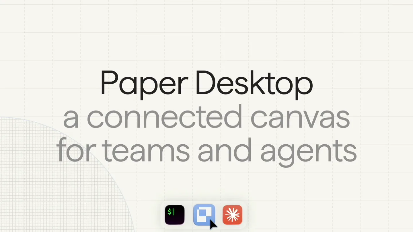
- Paper Desktop a connected canvas for teams and agents
- Camera
- Static wide shot, then rapid cuts to close-ups of UI elements, followed by a dynamic grid view of multiple UI instances.
- Motion
- Rapid cuts, UI element zooms, grid multiplication, and subtle background grid animation.
Problem Agitation
Bridging Dev and Design: Full Circle Workflow
“(No spoken dialogue — Electronic beat maintains intensity, ticking clock sound evolves, with more complex percussive layers and sweeps.)”
- On screen
- full circle dev to design
- Camera
- Alternating between static text overlays and dynamic split-screen views showcasing code editors and design tools.
- Motion
- Split-screen transitions, code editor typing animation, design system component highlighting, and rapid UI context switching.
Product Reveal
Pulling Real Data, Shipping More Design
“(No spoken dialogue — Beat intensifies with more aggressive electronic elements, building towards a climax with impactful sound design.)”
- On screen
- pull real data from anywhere
- Camera
- Dynamic camera pans across multiple application windows, showcasing data integration and responsive design variations.
- Motion
- Seamless window transitions, multi-instance UI display, responsive layout demonstrations, and content population animations.
Call to Action
Paper Desktop: Connected to Everything You Need
“(No spoken dialogue — Final powerful sub-bass drop and sustained electronic rhythm, fading out with a conclusive sound effect.)”
- On screen
- Paper Desktop connected to everything you need available today at paper.design
- Camera
- Static wide shot of the product tagline, followed by a clean display of the call to action URL.
- Motion
- Text reveal animation, subtle background grid movement, and a clean fade to the final call to action.
Motion design primitives
Synthesizable in Remotion · key components of the tech-product-launch-fast-cut template.
GridWarpTransition
A subtle, animated grid pattern in the background that warps or shifts perspective, often accompanied by a mouse cursor interaction or UI element appearing over it. It creates a sense of depth and digital environment.
+ Code construction recipe
Implement using a Remotion <AbsoluteFill> with an SVG filter for grid lines, animated with `interpolate` for position and opacity. Use `spring` for cursor hover effects or UI element pop-ins.
MultiScreenCarousel
Multiple instances of a UI or webpage are displayed simultaneously, often in a grid or carousel layout, showcasing variations (e.g., color themes, responsive layouts) or different stages of a workflow.
+ Code construction recipe
Utilize Remotion's `<Sequence>` and `<AbsoluteFill>` to layer multiple `<Composition>` instances. Animate their `x`, `y`, `scale`, and `opacity` properties using `interpolate` or `spring` for a dynamic grid or carousel effect. Use `map` to render an array of UI states.
CodeDesignSplitView
A split-screen or side-by-side view that dynamically transitions between a code editor interface and a design tool interface, highlighting the seamless connection between development and design.
+ Code construction recipe
Create two `<Composition>` components for the code editor and design tool. Use `interpolate` to animate the `width` or `x` position of each component, creating a wipe or slide transition. Synchronize typing animations in the code editor with design changes in the other view.
Style DNA & aesthetic system
Visual aesthetic
Typography
Motion
Special effects
Pacing & rhythm
Conceptual story rhythm
- 1
The Vision
Purpose. Introduce the core concept of Paper Desktop as a unified canvas for agents and teams.
Execution. Opening title card with product name and tagline, followed by rapid cuts showcasing the product's UI in action, emphasizing collaboration and interconnectedness.
- 2
The Integration
Purpose. Demonstrate how Paper bridges the gap between development and design workflows.
Execution. Split-screen views of code editors and design tools, showing real-time updates and synchronized changes, highlighting the 'full circle dev to design' concept.
- 3
The Power
Purpose. Showcase the product's ability to pull real data and enable rapid design iteration.
Execution. Dynamic displays of data integration, responsive design variations across multiple screens, and efficient content management within the platform.
- 4
The Call
Purpose. Conclude with a clear call to action and reinforce the product's value proposition.
Execution. Final tagline emphasizing connectivity, followed by a clean display of the product website for immediate access.
Remix in Animatiq Studio
Master remix prompt · agent-ready
Sample remix
Objective
Launch a new AI-powered data visualization tool called 'InsightFlow' that helps teams collaboratively explore complex datasets.How the recipe adapts
The recipe adapts by replacing design tool UIs with interactive data dashboards and code editors with data query interfaces. The 'MultiScreenCarousel' primitive will showcase different visualization types or collaborative editing sessions. The 'CodeDesignSplitView' will become a 'DataQueryVisualizationSplit' showing raw data input alongside its real-time visual representation. The 'GridWarpTransition' will be used to emphasize data flow and processing, with the grid lines subtly animating to represent data streams. The color palette will shift to cool blues and greens to reflect data and intelligence, maintaining the clean sans-serif typography.Remix blueprint · tech-product-launch-fast-cut
Scene durations (4 scenes, 64s)
Key Remotion components
Related Creative Tools Product Launches
Explore all Creative Tools launches →
Anthropic Labs launches Claude Design, which turns conversation into prototypes, slides and one-pagers, powered by Claude Opus 4.7.
A vibe design partner with an AI-native canvas for turning ideas into UI.
Your work tools in Claude are now available on mobile. Explore Figma designs, create Canva slides, check Amplitude dashboards, all from your phone. Give it a try: