
StylexUI · Launch Video Breakdown: Hook, Pacing & Motion Design
StylexUI launches with 15+ UI components built on StyleX and Base UI, ready for React, Next.js, and TanStack Start, added through the shadcn CLI.
Scene-by-scene timeline & spoken transcript
The Hook
Hero Introduction & Value Proposition
“(No spoken dialogue — Upbeat electronic score with a subtle riser at 0:00, building energy.)”
- On screen
- StylexUI Components Blocks Templates Coming Launch 15+ Components Craft AI-Ready Web Apps With StyleX UI Components Design gracefully, build powerfully, scale without limits. The ultimate StyleX toolkit for designers and developers to launch big ideas without settling on quality. Components Explore All ↓ StyleX Base UI React Next TanStack Start Lightning Fast Built entirely with StyleX, your app stays incredibly fast and your styles never accidentally break, no matter how big your project gets. AI Friendly We kept the code clean and simple so Al coding tools can actually understand it. Building your next smart application just got a lot easier. Copy & Paste Grab the exact blocks you need, drop them into your project, and easily make them your own. Skip the boring setup and launch faster. localhost:3000
- Camera
- Static, wide shot of a web page, simulating a user's initial view.
- Motion
- Subtle cursor hover and click animation, revealing interactive elements and text highlights.
Product Reveal
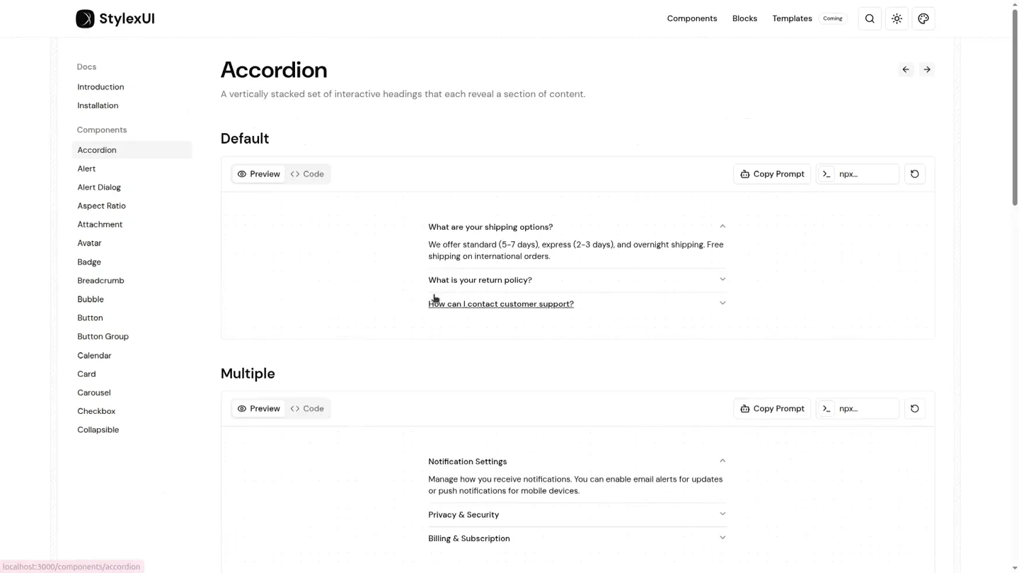
Component Showcase: Interactive Elements
“(No spoken dialogue — Electronic score continues with a noticeable sweep and sub-bass drop at 0:08, marking a transition.)”
- On screen
- StylexUI Docs Introduction Installation Components Accordion Alert Alert Dialog Aspect Ratio Attachment Avatar Badge Breadcrumb Bubble Button Button Group Calendar Card Carousel Checkbox Collapsible Accordion A vertically stacked set of interactive headings that each reveal a section of content. Default Preview <> Code Copy Prompt > np.x... What are your shipping options? What is your return policy? Returns accepted within 30 days. Items must be unused and in original packaging. Refunds processed within 5-7 business days. How can I contact customer support? Multiple Preview <> Code Copy Prompt > np.x... Notification Settings Manage how you receive notifications. You can enable email alerts for updates or push notifications for mobile devices. Privacy & Security Billing & Subscription Alert Displays a callout for user attention. Default Preview <> Code Copy Prompt > np.x... Payment successful Your payment of $29.99 has been processed. A receipt has been sent to your email address. New feature available We've added dark mode support. You can enable it in your account settings. Basic Preview <> Code Copy Prompt > np.x... Account updated successfully Your profile information has been saved. Changes will be reflected immediately. Action Alert Dialog A modal dialog that interrupts the user with important content and expects a response. Default Preview <> Code Show Dialog Copy Prompt > np.x... Are you absolutely sure? This action cannot be undone. This will permanently delete your account from our servers. Cancel Continue Basic Preview <> Code Show Dialog Copy Prompt > np.x... Destructive Preview <> Code Copy Prompt > np.x... Aspect Ratio Displays content within a desired ratio. Default Preview <> Code Copy Prompt > np.x... Portrait Preview <> Code Copy Prompt > np.x... Attachment A component for attaching and uploading files with various states and triggers. Default Preview <> Code Copy Prompt > np.x... Group Preview <> Code Copy Prompt > np.x... Avatar An image element with a fallback for representing the user. Default Preview <> Code Copy Prompt > np.x... +3 Basic Preview <> Code Copy Prompt > np.x... Sizes Preview <> Code Copy Prompt > np.x... Badge Displays a badge or a component that looks like a badge. Default Preview <> Code Badge Secondary Destructive Outline Copy Prompt > np.x... Variants Preview <> Code Default Secondary Destructive Outline Ghost Copy Prompt > np.x... With Icon Preview <> Code Copy Prompt > np.x... Breadcrumb Displays the path to the current resource using a hierarchy of links. Default Preview <> Code Home > Components > Breadcrumb Copy Prompt > np.x... Basic Preview <> Code Home > Components > Breadcrumb Copy Prompt > np.x... Collapsed Preview <> Code Copy Prompt > np.x... Bubble A message bubble component commonly used in chat and discussion interfaces. Default Preview <> Code Hey there! what's up? Copy Prompt > np.x... Hey! Want to see chat bubbles? I can group messages, switch sides, and keep the whole thread easy to scan. Sure. Hit me with your best demo. Yes. You are reading a demo that is demoing itself. Very meta. Very on-brand. +2 Alignment Preview <> Code Copy Prompt > np.x... Button Displays a button or a component that looks like a button. Default Preview <> Code Button ↑ Copy Prompt > np.x... Secondary Preview <> Code Secondary Copy Prompt > np.x... Destructive Preview <> Code Copy Prompt > np.x... localhost:3000/components/accordion localhost:3000/components/alert localhost:3000/components/alert-dialog localhost:3000/components/aspect-ratio localhost:3000/components/attachment localhost:3000/components/avatar localhost:3000/components/badge localhost:3000/components/breadcrumb localhost:3000/components/bubble localhost:3000/components/button
- Camera
- Simulated user interaction, rapidly navigating through a sidebar menu, triggering component previews.
- Motion
- Fast-paced, sequential UI navigation with instant component rendering. The cursor acts as a guide, highlighting selected menu items.
Feature Teaser
Component Showcase: Advanced Interactions
“(No spoken dialogue — Electronic score maintains energy with another sweep at 0:16, continuing the rapid pace.)”
- On screen
- StylexUI Docs Introduction Installation Components Accordion Alert Alert Dialog Aspect Ratio Attachment Avatar Badge Breadcrumb Bubble Button Button Group Calendar Card Carousel Checkbox Collapsible Button Group A container that groups related buttons together. Default Preview <> Code ← Archive Report Snooze ... Copy Prompt > np.x... Size Preview <> Code Small Button Group + Default Button Group + Large Button Group + Copy Prompt > np.x... Orientation Preview <> Code Copy Prompt > np.x... Calendar A date field component that allows users to enter and edit date. Default Preview <> Code < Aug 2026 > Su Mo Tu We Th Fr Sa 26 27 28 29 30 31 1 2 3 4 5 6 7 8 9 10 11 12 13 14 15 16 17 18 19 20 21 22 23 24 25 26 27 28 29 30 31 1 2 3 4 5 Copy Prompt > np.x... Basic Preview <> Code < August 2026 > Su Mo Tu We Th Fr Sa Copy Prompt > np.x... Card Displays a card with header, content, and footer. Default Preview <> Code Login to your account Enter your email below to login to your account Sign Up Email m@example.com Password Forgot your password? Login Login with Google Copy Prompt > np.x... Image Preview <> Code Copy Prompt > np.x... Carousel A carousel with motion and swipe capabilities. Default Preview <> Code 1 Copy Prompt > np.x... Sizes Preview <> Code Copy Prompt > np.x... localhost:3000/components/button-group localhost:3000/components/calendar localhost:3000/components/card localhost:3000/components/carousel
- Camera
- Continued rapid navigation through the sidebar, showcasing more complex UI components like calendars and carousels.
- Motion
- Interactive component demonstrations (e.g., calendar date selection, carousel slide transition) integrated into the rapid UI navigation.
Call to Action
Final Components & Brand Reinforcement
“(No spoken dialogue — The electronic score culminates with an impactful sub-bass drop at 0:24, signaling the video's conclusion.)”
- On screen
- StylexUI Docs Introduction Installation Components Accordion Alert Alert Dialog Aspect Ratio Attachment Avatar Badge Breadcrumb Bubble Button Button Group Calendar Card Carousel Checkbox Collapsible Checkbox A control that allows the user to toggle between checked and not checked. Default Preview <> Code Accept terms and conditions Accept terms and conditions By clicking this checkbox, you agree to the terms. Enable notifications You can enable or disable notifications at any time. Copy Prompt > np.x... Basic Preview <> Code Accept terms and conditions Copy Prompt > np.x... Description Collapsible An interactive component which expands/collapses a panel. Default Preview <> Code Order #4189 Status Shipped Copy Prompt > np.x... Basic Preview <> Code Product details Copy Prompt > np.x... Settings Panel Preview <> Code Copy Prompt > np.x... localhost:3000/components/checkbox localhost:3000/components/collapsible localhost:3000
- Camera
- Final rapid navigation, ending with a brief pause on the 'Collapsible' component before a quick fade to white.
- Motion
- The video concludes with a final burst of component previews, reinforcing the breadth of the offering, followed by a clean, swift exit.
Motion design primitives
Synthesizable in Remotion · key components of the rapid-ui-showcase-template template.
InteractiveComponentDemo
Simulated user interaction within a UI component (e.g., clicking an accordion, selecting a date on a calendar, navigating a carousel) with immediate visual feedback.
+ Code construction recipe
Utilize `sequence()` to orchestrate clicks and subsequent state changes. For interactive elements like carousels, use `interpolate()` on `translateX` for smooth sliding, combined with `spring()` for button presses or toggles.
RapidUISequenceCut
A very fast, almost instantaneous cut between different UI states or component views, driven by the audio track's energetic rhythm.
+ Code construction recipe
Employ `AbsoluteFill` for each UI state. Use `delay()` and precise `durationInFrames` for each scene to align with the audio beats. No explicit transition animation between cuts, relying on the quick timing for impact.
Style DNA & aesthetic system
Visual aesthetic
Typography
Motion
Special effects
Pacing & rhythm
Conceptual story rhythm
- 1
The Grand Overview
Purpose. Introduce the product's core value proposition and key benefits.
Execution. Static hero shot of the landing page, highlighting main features and technologies with subtle cursor interaction.
- 2
Rapid Component Tour
Purpose. Demonstrate the breadth and variety of available UI components.
Execution. Fast-paced navigation through a sidebar menu, instantly rendering and briefly interacting with each component.
- 3
Interactive Deep Dive
Purpose. Showcase the interactive capabilities and responsiveness of complex components.
Execution. Focused, quick demonstrations of component functionality (e.g., accordion expansion, calendar date selection, carousel swipe).
- 4
Call to Action & Reinforcement
Purpose. Conclude with a final impression of completeness and prompt user engagement.
Execution. Final rapid component previews, ending with a clean fade-out, reinforcing the brand.
Remix in Animatiq Studio
Master remix prompt · agent-ready
Sample remix
Objective
Launch a new AI-powered code refactoring tool called 'RefactorFlow'.How the recipe adapts
The 'RefactorFlow' video would open with a hero shot of its web interface, showcasing its tagline 'Intelligent Code Transformation'. The rapid UI sequence would then navigate through a sidebar listing features like 'Dead Code Elimination', 'Complexity Reduction', and 'Style Consistency'. Each selection would instantly display a code editor with a before-and-after refactoring example, using the InteractiveComponentDemo primitive to highlight the AI's changes. The video would maintain the fast-paced electronic score and Grotesque Sans-serif typography, ending with a call to action to 'Try RefactorFlow Today'.Remix blueprint · rapid-ui-showcase-template
Scene durations (4 scenes, 30s)
Key Remotion components
Related Creative Tools Product Launches
Explore all Creative Tools launches →
A vibe design partner with an AI-native canvas for turning ideas into UI.

We heard you wanted to use Codex rate limit resets on your own time. Starting today, we’re rolling out the ability to save rate limit resets to use later. We’re starting Go, Plus, Pro, and Business

There's a hidden tax on every knowledge worker in the world, and nobody talks about it: The design tax. You're a strategist, a sales lead, a marketer. You were hired for what you know. But every me…