
Kinetic typography, explained with real examples
The technique is animating letters, not text boxes. Here is the difference, and six catalog components that show it.
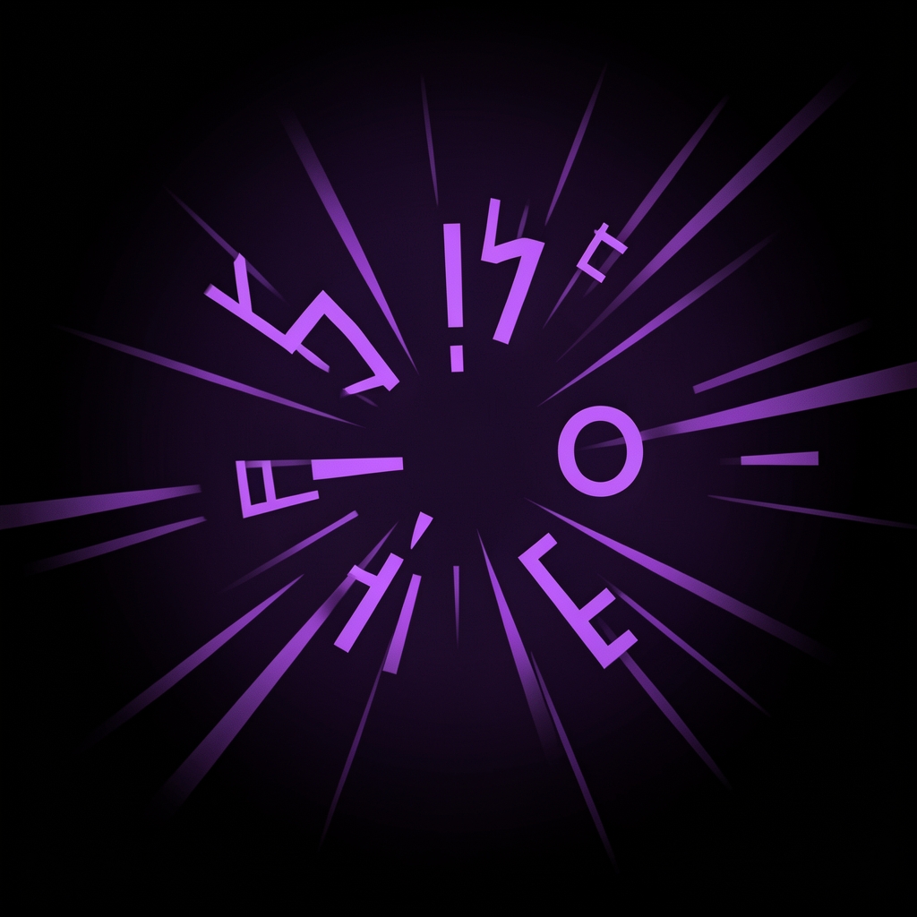
Most things people call kinetic typography are not. Sliding a caption box across the screen is not kinetic typography — the letters inside it are just cargo, moving because the box moves. Real kinetic typography treats the letters themselves as the subject: staggering them, shifting their weight, tracking them apart on an emphasis, swapping one word for another on a beat.
The test is simple. If you removed the animation and the words still read as a static caption, it was never kinetic typography — it was a caption with a transition.
Six ways it actually works
Staggered entrance. Letters or words arrive one after another rather than all at once, so the eye reads them in the order they appear rather than all at once. The kinetic slam style does this hard and fast; a calmer stagger reads as more editorial.
Weight and scale shifts. A word gets heavier or larger exactly on the beat that matters, then settles back. This is emphasis without changing the words — the equivalent of raising your voice on one syllable.
Per-word crossfade. Words dissolve into the next rather than cutting, useful when the rhythm is closer to speech than to music. Good for voiceover-led pieces where a hard cut between words would feel mechanical.
Scramble and decode. Letters cycle through random characters before settling on the real word — a reveal technique borrowed from title sequences, effective exactly once per piece before it reads as a gimmick.
Tracking pulls. Letter spacing widens or tightens as a word appears, which reads as either confidence (tightening in) or announcement (widening out) depending on direction.
Line-by-line builds. For longer statements, each line enters on its own beat rather than the whole block appearing together — this is closer to a title card than a caption, and works best when there is time to let each line land.
Where it breaks
The common failure is uniform timing: every word entering with the same duration and the same ease, regardless of whether the word matters. That is the tell of a template rather than a considered choice — real emphasis is uneven, because real speech is uneven.
The other failure is using it everywhere. Kinetic typography works because it is doing something a static caption cannot; a video where every line of text gets the full treatment has no baseline to emphasize against, so nothing reads as emphasized.
The full glossary has the rest of the vocabulary — lower thirds, match cuts, easing — if the terms themselves are the gap.